
Scientists collected fresh data on Orion’s bright star Betelgeuse to try and understand this star that caused so much controversy last year. They found it’s smaller than previously calculated, and last year’s dimming was likely caused by dust, but it’s also more complex than thought. Plus, galaxies, Earth’s forests, ice on Mars, and Saturn’s moon Rhea.
Media

Transcript
Hello and welcome to the Daily Space. I am your host Dr. Pamela Gay.
And I am your host Beth Johnson.
And we are here to put science in your brain.
Science is, overall, a steady march forward, with new understandings and new discoveries helping us get closer and closer to the truth of our universe. The thing is, the overall direction of progress isn’t the same as the day-to-day progress, and just like when you’re cleaning your bedroom, sometimes things are going to get worse before they get better.
Annoyingly, today’s lead story is one where the progress of science went boink.
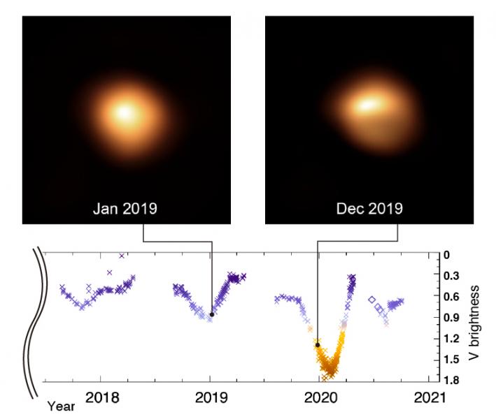
A little over a year ago, the bright star Betelgeuse faded in a way previously never seen. While captivating observers with its 50% drop in light, it also frustrated scientists. Located more than 500 light-years away, this giant star can be observed in just enough detail that we knew something weird was going on, but we couldn’t tell what. Early theories pointed to there either being a dusty outburst, giant starspots had formed, or maybe it had just dropped in temperature. It seemed that dust was the most likely culprit, with the color of Betelguese not changing as you’d expect with a temperature drop and with the changes over time looking more dust-like than starspot-like.
But looking more like something, and actually being that something, those aren’t the same.
A new paper accepted to The Astrophysical Journal with lead author Graham Harper uses five years of observations to understand this star in a context that looks at before, during, and after the dimming event. They also start from scratch — calculating their own values for the star’s temperature, size, and location in a consistent way.
With this new analysis, they found Betelgeuse’s behavior can be reproduced in models if the star’s outer photosphere is treated as multiple components of different temperatures. This is consistent with prior observations by the Very Large Telescope in Chile and basically means the outer layers of the star are like nesting balls that aren’t entirely solid, and each shell has different holes that allow the shells beneath to be seen – or not – at different times.
According to the paper: These suggest that the cooling of a large fraction of the visible star has a dynamic origin related to the photospheric motions, perhaps arising from pulsation or large-scale convective motions.
That’s a lot of ideas packed into one sentence. Let’s break it down.
The first thing to note is they point out that we saw dimming of the visible part of the star and that doesn’t mean the entire star dimmed. They also match that dimming to temperature. This is like a hot fire burning brighter than a cool fire. But if the different layers of the star’s photosphere have different temperatures, and sometimes we see more of some layers than others, it’s possible that the motions of those layers caused us to see one of the cool layers covering a large part of the star we could see. Since only part of the star was cooler, we still saw light from the hot parts, leading to confusion about how the star’s temperature may have changed.
Depending on how the star was observed, different teams would come to different conclusions, and the dust theory would seem to fit if you didn’t see the place to place temperature changes. This new way of looking at Betelgeuse also explains the timing of this great dimming.
Betelguese is a variable star, and it is pulsing with multiple beats that aren’t always in sync. One of those pulsations is a 430-day beat, and the other is 5.8 years. Like windshield wipers that aren’t in sync, these pulsations do sometimes line up, and last January was one of those times, with the both pulses working together to dim the star. While this wasn’t expected to make Betelguese as faint as we saw — and we certainly hadn’t seen this before — these combined motions could have led to a large fraction of the visible star being cooler.
And the images seem to bear this out. We can see that a large fraction of Betelguese appears fainter.
Is this the final answer? No idea. But this paper does one very important thing: it calls out the need to gather all the data from all the telescopes and analyze it together. There is a tendency for researchers to each take their own data, process it, publish their results, and at a certain level say “mine mine mine”. But this is a bit like blind men each trying to understand an elephant based on what they feel in front of them. Each person has a true and valid observation, but the whole can only be understood by combining all the observations.
Here is hoping that this paper’s authors can pull together all the Betelguese researchers and their data, and work together to understand this giant red star of confusion.
Every galaxy is different, just like snowflakes, humans, and oak trees. While everyone is unique, we can understand them by looking at them in large numbers and looking for trends.
For instance, snowflakes have different sizes and structures depending on temperature, moisture in the air, and even details like wind, and you’ll get similar – but not identical – snowflakes when conditions are the same.
Growing conditions matter; children with better access to high-quality foods will grow taller and healthier, while those with contaminated water and poor nutrition will reflect these poor conditions in their bodies, and sometimes even in their minds.
Even location matters, with oak trees growing to different sizes and shapes depending on if they are located on a windy cliff, in a crowded pine forest, or in beautiful isolation in a city park (more on that later).
With galaxies, all these factors matter, and for the past seven years, the SAMI Survey at the four-meter Anglo-Australian Telescope has been taking detailed observations of galaxies in a wide range of circumstances to understand what factors literally shape them. This telescope is able to observe thirteen galaxies at a time, and the survey has just published its complete catalog of over three thousand galaxies.
According to lead author Scott Croom: The sheer size of the SAMI Survey lets us identify similarities as well as differences, so we can move closer to understanding the forces that affect the fortunes of galaxies over their very long lives.
These forces are the galaxy versions of nutrition and environment, and in this vast universe, galaxies occupy nearly countless different habitats. Croom continues: The nature of galaxies depends both on how massive they are and their environment. For example, they can be lonely in voids, or crowded into the dense heart of galactic clusters, or anywhere in between. The SAMI Survey shows how the internal structure of galaxies is related to their mass and environment at the same time, so we can understand how these things influence each other.
This catalog of 3,068 galaxies is published in the Monthly Notices of the Royal Astronomical Society. Since this is a data release, we know what the survey can tell us, but we don’t yet know what it has told us. Those papers are still to come, and when they do, we’ll bring them to you here on the Daily Space.
Location matters most for the special galaxies at the hearts of galaxy clusters. These giant elliptical galaxies have gone by many names over the years, from cD galaxies to brightest cluster galaxies, but no matter what you call them, these systems do not behave like other elliptical galaxies.
For instance, in Astro 101, students are taught that elliptical galaxies are red and dead — meaning they are filled with old red stars and are considered dead because they no longer have star formation. Central galaxies, it turns out, can be quite a bit different.
In a new paper in Astronomy & Astrophysics with first author Bianca-Iulia Ciocan, researchers discuss the central galaxy in the massive MACS 1931.8-2635 galaxy cluster. This galaxy is roughly ten times the size of our Milky Way and is anything but dead; it is churning out nearly a hundred solar masses of stars per year. For comparison, our galaxy churns out a couple of new stars a year.
This star formation is made possible by the infall of material from the surrounding intracluster medium and from the disrupted tails of material that signal galaxy mergers or collisions have taken place. Due to its distance, we can’t make out all the individual stars in the galaxy, but their combined light indicates 80% of the galaxy’s mass formed more than six billion years ago, and the observed star formation today is a new phase of star formation.
A new and beautiful phase of star formation.
There’s an old Earth saying about “not being able to see the forest for the trees”. Oh, sorry. Been watching a little too much Star Trek of late. Anyway, this next story is trying to see the forest instead of just the trees.
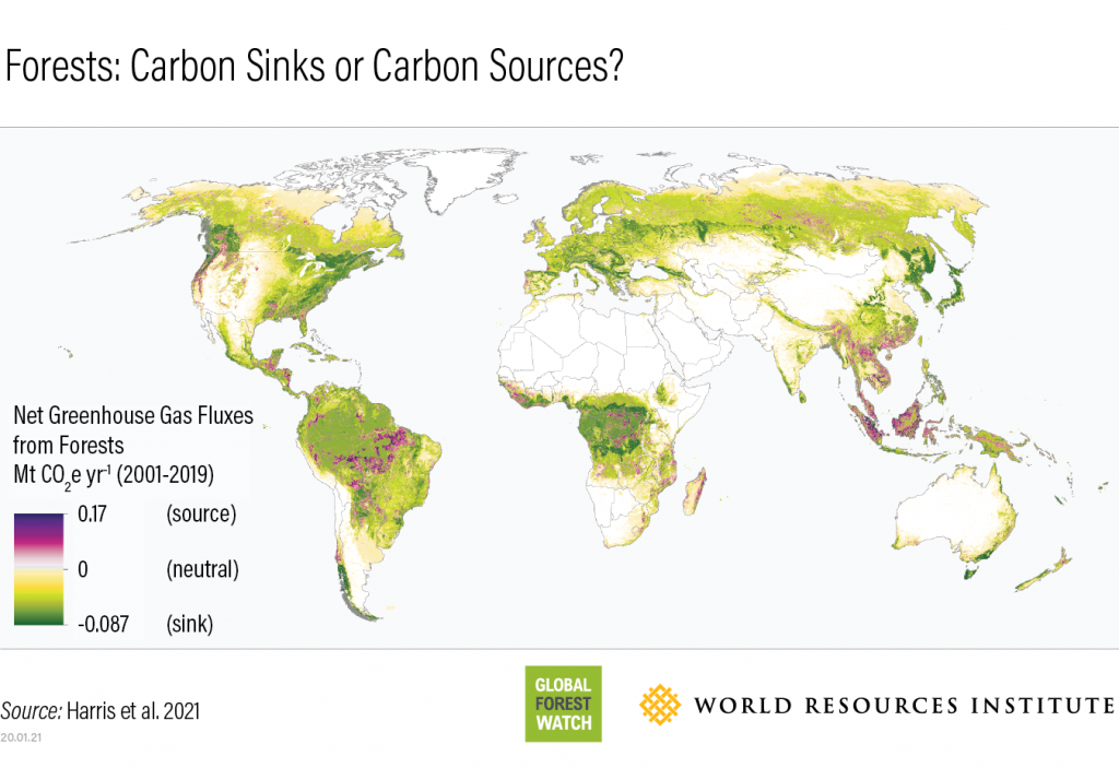
The Global Forest Watch published a new paper in Nature Climate Change last month that presented a current forest carbon flux map. The paper looked at just how much carbon dioxide we can sink into the current levels of forestation around the world. First, they measured the biomass of the forests with NASA’s ICESat data. Yes, there’s a backronym in there. ICESat stands for Ice, Cloud, and land Elevation Satellite. Bring on the BABIES award.
From that data, the researchers could calculate how much carbon dioxide could be absorbed by the trees, and then they balanced that out with the amount of carbon dioxide released into the atmosphere from deforestation, fires, etc. Per the press release: According to the researchers, forests collectively absorbed around 15.6 billion metric tons of carbon dioxide from Earth’s atmosphere each year between 2001 and 2019, while deforestation, fires, and other disturbances released an average of 8.1 billion metric tons of carbon dioxide per year. Forests around the world are estimated to absorb about 7.6 billion metric tons, acting as a net carbon sink of roughly 1.5 times the annual emissions from the entire United States.
Not bad, but not great, since the United States is only one country amongst many. It’s a starting point, though, for us to really comprehend just how much we need to cut carbon dioxide emissions and how many trees we need to keep around.
And about those trees, like the oaks, we mentioned earlier. We do have to look at them individually as well, and for all we Californians get annoyed at lawns that use too much water, it turns out that the English did something right when it came to trees planted along streets. With nearly 85% of the world’s population living in urban areas, we see more trees in cities than in forests. And the lockdown made this even more apparent as people couldn’t get out to visit forests.

There’s even an app for that called Tree Talk, which saw users increase over 50% as people started looking for local trees to visit. And of course, these trees provide lots of benefits beyond our own personal connection with nature and being great carbon sinks. They support wildlife, they protect against urban flooding, they reduce temperatures, and they even help lower the prevalence of asthma.
So next time your local town starts talking about cutting down that big tree, make sure they have a really good reason. We still need to see the trees, too, and not just the forests.
From trees affecting climate change, we now look at how lava affects the magnetic field. It’s a bit of a leap but bear with us here.
In new work published in JGR: Solid Earth, researchers sampled lava flows from around Mount Erebus in Antarctica. They then analyzed the magnetic properties of the rocks to understand the paleomagnetic field changes in the past.
Here’s how that is possible: when rocks cool, the minerals in the rocks form crystals, and if those minerals contain iron, which basaltic lava such as that in Antarctica or Hawaii or the mid-Atlantic ridge does, those crystals align themselves with the Earth’s magnetic field. Just like the needle on a compass. And we can then analyze the age of the rocks using radiometric dating like we talked about last week and figure out which direction the magnetic field’s north pole was from the rocks.

We have to do a little backtracking because, of course, plate tectonics are a thing and continents move around, but we have a pretty good record of the rocks in the Atlantic Ocean, which don’t move that much. All of this information can now be combined into a history of our magnetic field.
The new paper, however, shows that the direction of the poles is all we can really extrapolate from all that data. It doesn’t tell us anything about how the field was shaped otherwise. To understand the shape of the magnetic field, the researchers plan to sample more rocks from more locations and attempt to put together a complete picture of the paleohistory of our magnetic field, looking at intensity as well as direction.
Next, we bring you another story of ice on Mars. We’re going to have a bigger story about this in a couple of days and possibly a guest, but let’s start with today’s news first.
A new study of the ice cap at Mars’ north pole was published in JGR: Planets, and it took a look at the ripple features using HiRISE images. They then created a model to simulate interactions between the ice and climate to see if they could generate those ripples. The model uses solar radiation values and the geometry of that radiation hitting one side of the ice cap but not the other, stretching out the ripples in one direction.
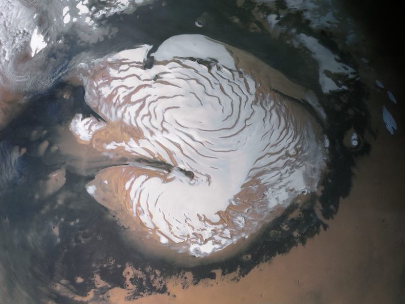
Once the model matched the images, the team found that the ripples were 10 meters across and one meter deep. Per the article in Eos: As the features age, the wavelength—the distance between each ripple—increases, and the ripples move toward the pole. This behavior held constant regardless of whether the researchers increased the atmospheric water vapor density or dialed it to zero, suggesting that the pattern forms regardless of whether the total amount of ice is increasing or decreasing.
This research gives us another piece of the climate change puzzle for Mars, and will hopefully lead to an understanding of when these changes happened. In this case, the wrinkles on the ice cap give an age of about 1000-10000 years. Not old at all, but we need more data.
Once again, we are reporting on molecules in the atmosphere of a distant world. Instead of Venus or Titan, we’re talking about Saturn’s moon, Rhea. In a new report in Science Advances, a team of researchers claims to have found evidence of hydrazine. As always, we want to remind you all that this data comes from the amazing Cassini mission, which is the mission that keeps on giving despite ending years ago.
The team analyzed the ultraviolet spectroscopy of the moon’s atmosphere, and found a particular absorption feature that could be explained by either hydrazine or chlorine-containing compounds. And while hydrazine was a propellant used by Cassini, those thrusters were not used while observing the icy satellite flybys to prevent such contamination, so if the signal is from hydrazine, it’s not fuel from the spacecraft.
So how could hydrazine be formed on Rhea? That part is a bit unclear. Per the press release: The E-ring grains of Saturn could bombard and coat much of the surface of Rhea, and such bombardments from different sources could cause chemical changes in the irradiated surface to synthesize a rich surface chemistry.
In addition to that, the irradiation of ammonia by charged particles from Saturn’s magnetosphere induced the dissociation of ammonia molecules to form diazene and hydrazine.
But we haven’t really studied Rhea’s surface, so figuring out where the ammonia might come from is still a question to answer. More orbiters!
Wait, we have more orbiters! Just around Mars, not Saturn. The tiny nation of the United Arab Emirates has shown off its interplanetary science chops but entering orbit with its Al Amal, or Hope, mission. This is a Mars orbiter that joins the existing multinational fleet circling the Red Planet.
Tomorrow the Tianwen-1 mission should enter orbit where it will begin several weeks of orbiting and imaging before dropping its own lander and rover. While the mission isn’t yet in orbit, it has sent back some stunning images of Mars that are already captivating social media.
And finally, we have news from our old friend OSIRIS-REx. This little mission to the small asteroid, Bennu, has completed all its primary science goals — from mapping the asteroid to retrieving a rock sample — everything worked, which is really amazing considering the asteroid was not at all what was expected or planned for. Before departing Bennu on May 10, OSIRIS-REx is going to do a final flyby, capturing additional images of interesting spots, including looking to see if the divot it left in the Nightingale Crater is visible.
This has been the Daily Space.
Learn More
Betelgeuse Reanalyzed, Resized, and Still a Mystery
- Kavli IPMU press release
- “Standing on the Shoulders of Giants: New Mass and Distance Estimates for Betelgeuse through Combined Evolutionary, Asteroseismic, and Hydrodynamic Simulations with MESA,” Meridith Joyce et al., 2020 October 13, The Astrophysical Journal (preprint on arxiv.org)
SAMI Survey Releases Catalog of 3000 Galaxies
- Astro3D press release
- “The SAMI Galaxy Survey: the third and final data release,” Scott M Croom et al., 2021 February 1, Monthly Notices of Royal Astronomical Society
Bright Cluster Galaxy in Distant Galaxy Cluster Observed
- Phys.org article
- “The VLT-MUSE and ALMA view of the MACS 1931.8-2635 brightest cluster galaxy,” B.I. Ciocan et al., to be published in Astronomy & Astrophysics (preprint on arxiv.org)
Global Forest Watch Publishes Forest Carbon Flux Map
- NASA press release
- “Global maps of twenty-first century forest carbon fluxes,” Nancy L. Harris et al., 2021 January 21, Nature Climate Change
Mature Street Trees Better Than Planting New Trees
- The Conversation article
Using Ancient Lava Deposits to Understand Earth’s Past Magnetic Field
- Eos article
- “Four‐Dimensional Paleomagnetic Dataset: Plio‐Pleistocene Paleodirection and Paleointensity Results From the Erebus Volcanic Province, Antarctica,” H. Asefaw et al., 2020 December 4, JGR Solid Earth
Modeling Mars’ North Polar Ice Cap to Understand Age
- Eos article
- “Surface Roughness Evolution and Implications for the Age of the North Polar Residual Cap of Mars,” A. X. Wilcoski and P. O. Hayne, 2020 November 19, JGR Planets
Possible Detection of Hydrazine in on Saturn’s Moon Rhea
- Phys.org article
- “Possible detection of hydrazine on Saturn’s moon Rhea,” Mark Elowitz et al., 2021 January 22, Science Advances
Credits
Written by Pamela Gay and Beth Johnson
Hosted by Pamela Gay and Beth Johnson
Audio and Video Editing by Ally Pelphrey
Content Editing by Beth Johnson
Intro and Outro music by Kevin MacLeod, https://incompetech.com/music/
 We record most shows live, on Twitch. Follow us today to get alerts when we go live.