
Scientists discovered from the data sent back from Voyager 2 that Uranus had a plasmoid, a magnetic blob of atmosphere stuck out away from the planet, the Nobeyama Radio Observatory Star Formation Project mapped in greater detail than ever before a series of star forming regions, and Comet Atlas will be bringing a show in May and June to your backyards.

Links
More secrets from Voyager 2 info revealed
Star formation project maps edges of interstellar clouds
- Astronomers have found the edge of the Milky Way at last (ScienceNews)
- Star Formation Project Maps Nearby Interstellar Clouds (Nobeyama Radio Observatory)
Comet Atlas
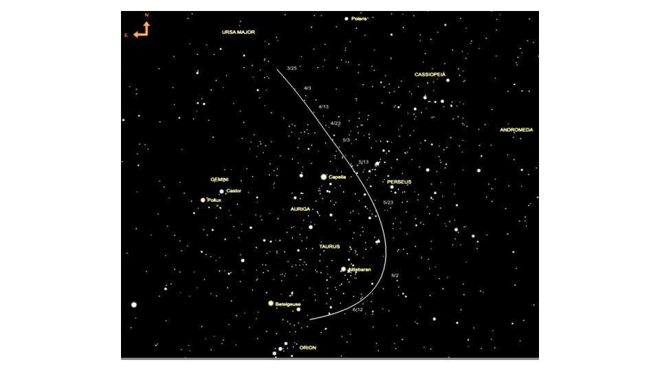
- Comet ATLAS may soon be visible to the naked eye (Astronomy.com)
Transcript
This is the Daily Space for today, Thursday, March 26, 2020.
Welcome to the the Daily Space, I am your host, Dr Pamela Gay, and I am here to put science in your brain. Most Mondays through Fridays either I or my co-host Annie Wilson will be here, bringing you a quick run down of all that is new in space and astronomy.
CREDIT: NASA/JPL-Caltech
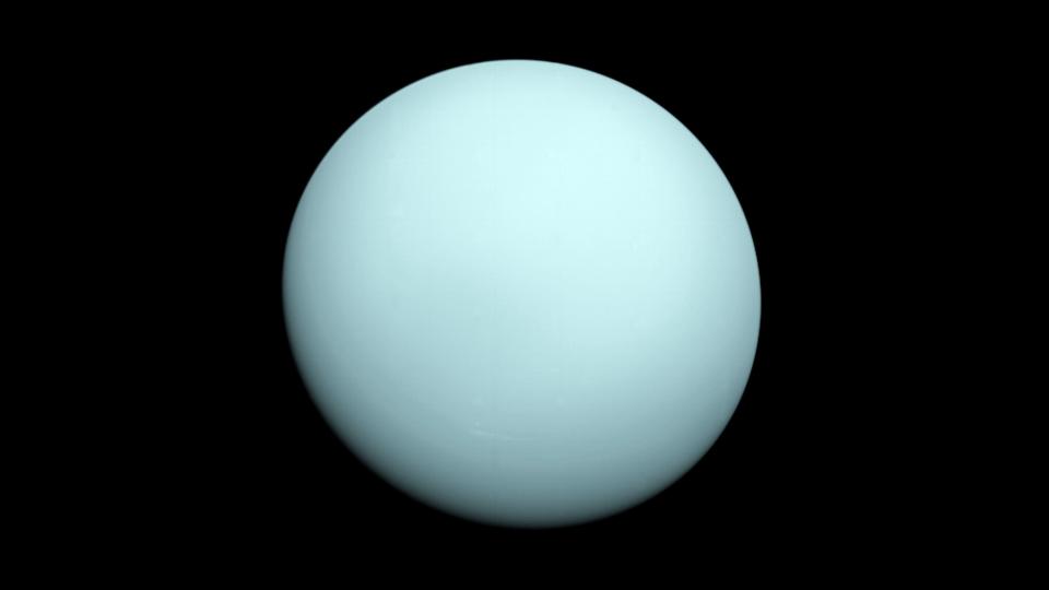
Right now, all around the world, we’re seeing museums, libraries, and other centers of knowledge set their content free. The Smithsonian museum has dropped millions of images onto the internet, and libraries are making online books even easier to access. This is awesome – it does raise the question of “If you had all this content already, why were you not sharing?” but… I’m hoping this data sharing is our new normal. In space science we have a long tradition of sharing our data, with major telescopes like the Very Large Array and Hubble Space Telescope putting their observations in vast databases that people can continue to explore for generations to come. Over the years, as technology and our understanding of science changes, we’re seeing new science come from old data. This week, NASA shared that planetary scientists revisiting Voyager 2’s data on Uranus had discovered that Voyager 2 flew through a plasmoid of atmosphere that Uranus had lost to space.
Voyager 2’s 1986 flyby of Uranus revealed an oddly tilted magnetic field that can’t be explained in a nice neat way. Something bad happened to this outer world at some point in the past, and now it is permanently tilted on its side, with its pole pointed at the sun twice a year as it goes through it’s weird summer and winter solstices. The magnetic field, however, isn’t aligned with the planet’s rotation. It’s actually tilted about 60 degrees off. It’s not unusual for a magnetic field to not be completely aligned with a world’s rotation, but Uranus goes to an extreme. If the Earth’s magnetic pole behaved like this, the North magnetic pole might be pointing out through New Orleans or Houston, instead of somewhere in the arctic sea.

CREDITS: NASA/Scientific Visualization Studio/Tom Bridgman
While planning for a hoped-for future mission to Uranus and Neptune, Gina DiBraccio and Dan Gershman reviewed Voyager 2’s data on Uranus’s weird magnetic field, and noticed a weird blip in the data. This odd shape in a graph of magnetic data is consistent with a blob of Uranus’s atmosphere getting pulled off where Uranus’s magnetic field and the Sun’s Magnetic field and the solar wind interact and tangle. These kinds of blobs are called plasmoids, and we didn’t know about them yet in 1986, and it was in the context of our modern understanding – brought to us from satellites orbiting Earth, Mars, Jupiter, and Saturn, that they could understand this data blip for Uranus.
Plasmoids like this carry away a world’s atmosphere a small bit at a time. While this has been devastating for world’s like Mars, Uranus is large enough that we won’t see it noticeably diminish over human timescales.
There isn’t a lot of new science to this story. Plasmoids happen, and there was no reason to think Uranus would be any different. This is a cool story, however, because the ability to say Uranus has plasmoids has been there for more than 30 years, but because no one looked at the right data since plasmoids were discovered, this discovery has just been sitting on magnetic tape, waiting to be spun up.
Right now, a lot of observatories have ceased scientific observations as people go home to socially distance. This doesn’t mean that new research can’t be done with data we already have. This new discovery, highlighted in a paper in the Geophysical Research Letters, shows old data still has a lot to offer. Now, I know a lot of people are struggling against the increased entropy of having a house full of children and often a partner. Most people are going to have their productivity destroyed by a lack of childcare and the loss of their support network. For those that don’t have chaos, however, science can go on. Let’s dig into the archive and make 1980’s data all the rage again.
Our next story of the day is one I debated talking about, because theoretically you shouldn’t talk if you’re not sure you have anything nice to say, and here, I’m not sure. A new paper posted on the astronomical part of the ArXiv.org preprint server is getting a lot of coverage for claiming our galaxy’s edge has finally been found, and our galaxy is significantly bigger than anyone ever thought. The problem with this paper, right off the bat, is there are a gazillion ways to define “edge”. Even with humans this can be tricky. Most people, if you ask them how tall they are, will give you the distance from the soles of their feet to the tops of their head, as measured while standing flat footed, but you could also measure to the top of their hair, giving some punk rockers one hell of a height advantage. You could also go by the maximum extension, and measure from the tip of a ballerina on pointed toes to the tip of her outstretched arm. Those latter measurements aren’t standard, but you can make those measurements and proclaim humans to be of unusual size.
In the same manner, we can measure galaxies in all sorts of different ways and get all sorts of different numbers, and that’s what’s happening here. Normally, we base our size measurements on looking at a galaxy through a specific filter, so we’re seeing light from the same kinds of objects, and we define the size based on where the brightness is some set fraction of the bright inner region of the galaxy. It’s a whole lot of math, but it keeps everything more or less consistent. What the folks in this paper have done is to instead try and sort using computer models and observations of nearby dwarf galaxies, and tried to sort how in-falling material might decide “I shall fall into the Milky Way” versus falling into something else like Andromeda.
There are soo many problems with saying “this is the edge” the first being that over the 13 billion year history of our universe, stuff has moved, and since galaxies grow through accumulation of colliding galaxies, these kinds of models can’t know how to accurately take into account stuff that we can’t see because we already ate it.
Anyway – folks have asked me about this story, and I’m just going to say this is a neat idea, but the physics of our reality doesn’t make this paper a solid way to say how big our galaxy may or may not be.
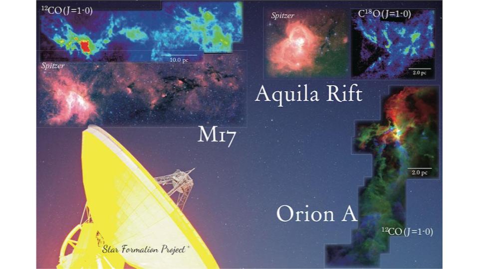
To round out our day, I have a couple quick notes on things to come. The NAOJ has released a publication describing how they have mapped in greater detail than ever before achieved a series of star forming regions. These new maps have a spatial resolution of about 3200 AU, which means individual solar systems can’t be resolved, but we can see the massive clouds that can collapse into solar systems clearly. These maps are new, and we look forward to seeing the science that will come out of this work.
CREDIT: Alison Klesman (via TheSkyX)
Finally, we’d like to alert you all to a comet that may just become really darn bright come Map. I’m talking about Comet Atlas, which is currently visible in small telescopes. This is the time for everyone to practice your astrophotography from your driveway and patio, and learn to find your way around the sky, so that you are ready in a few weeks when this system is at its best. I know some of you are already taking images, and I’m here to say, I want to see them! We have a new images channel setup on our CosmoQuest Discord channel where your astrophotography can be shared with adoring fans you didn’t know you had.
<———————>
As part of helping keep us all occupied in these really weird times, we’re going to be hosting a lot of additional content on our Twitch channel, and we want to remind you that CosmoQuest has an active community on Discord where you can talk science and even find other people to join you in playing some online games. You can find links to everything that is going on at CosmoQuest.org.
Thank you all for listening. Today’s script was written by Pamela Gay, and the Daily Space is produced by Susie Murph. The Daily Space is a product of the Planetary Science Institute, a 501(c)3 non profit dedicated to exploring our Solar System and beyond. We are here thanks to the generous contributions of people like you. The best way you can support us is through Patreon.com/cosmoquestx Like us? Please share us! You never know whose life you can change by adding a daily dose of science.
 We record most shows live, on Twitch. Follow us today to get alerts when we go live.